
Yesterday, Mark Gurman at Bloomberg has released a detailed report covering the design changes for iOS 27 as a whole, with plenty of details on the new Siri and upgraded Camera app. One of my favorite details might be good news for the Liquid Glass change I wanted most.
Apple redesigns iOS 27’s Liquid Glass tab bars, potentially solving my biggest problem

The iOS 27 unveiling is only a few weeks away, and the leaks about new features and changes just keep coming.
The last date of Bloomberg Mark Gurman, who reported yesterday on a variety of design updates in iOS 27. Gurman writes:
The next major iPhone software update, iOS 27, will also include notable design changes in several areas, including the digital assistant Siri, System Search, and apps like Safari, Image Playground, and Weather. Apple is also planning system-wide changes, such as new animations and redesigned tab bars.
It was the system-wide changes that particularly caught my attention. Previously, Gurman said that iOS 27 would bring “improvements” to Liquid Glass. But this latest report contains concrete details on the new system-wide designs.
For example, it mentions a new animation when loading the on-screen keyboard. It will “show keys sliding up from the bottom of the iPhone interface.”
Regarding tab bars in apps, he writes, “Apple is tweaking the tab bar at the bottom of several apps to combine the search tab with the rest of an app’s tabs.”
This idea of redesigned tab bars is what excites me the most. That’s because the tab bars in iOS 26 are my biggest gripe with Liquid Glass’s design.
iOS 26’s Tab Bars Look Like a Regression, and iOS 27 Could Fix Them

In iOS 26, Apple made the tab bars at the bottom of apps more transparent and split Search into a standalone button. Additionally, tab bars for multiple apps now collapse into a single icon in the lower left corner as you scroll.
It was this last tab bar change that gave me the problem.
Every day, several times a day, I have to tap on this minimized tab bar to make it appear again, then tap again to get to the tab I want.
This happens daily in the Photos, Music, and Podcasts app.
This added pressure, since it is necessary for the very common act of switching tabs, seems regressive.
I like the look of Liquid Glass tab bars, but this behavior seems very behind iOS 18.
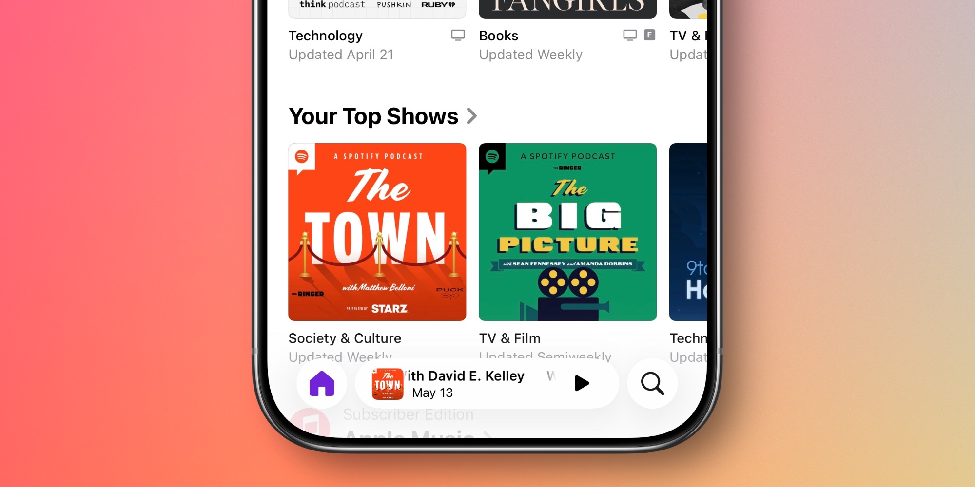
And to be clear, there are many apps in iOS 26 where tab bars work differently. News, Books, and TV all keep the full tab bar visible as you scroll.
Hopefully, integrating search into the tab bar means that iOS 27 will also roll back the tab bar minimize “feature.” Otherwise, there would apparently be no point in going back to iOS 18’s built-in design.
The App Store and Games brought search back into the tab bar in iOS 26.4, and neither app minimizes the bar.
Additionally, if Apple continues to shrink the tab bar in iOS 27, that means Search will also start to be hidden. And I will be very surprised if Apple makes tab bars worse in the new update. The company is pretty good at iterating on designs based on user feedback.
According to Gurman’s report, the most likely outcome is that my wish is granted, and the tab bars for all apps remain visible even while scrolling. And if that happens, my current biggest complaint about Liquid Glass will be resolved.
What new changes do you hope Apple will make to the design of iOS 27? Let us know in the comments.
Best iPhone accessories

FTC: We use automatic, revenue-generating affiliate links. More.